Cover Concepts
Presented for your opinion.
Three slightly different cover concepts for my WIP nearing completion. Which of these would most grab your attention, number one, two, or three?
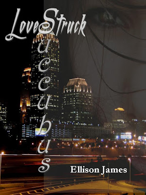


As you can see, the basic elements are the same. I want to have a woman's face superimposed into the Atlanta skyline. Specifically, the Four Season's Hotel depicted in all three concepts. Also, keep in mind that these are covers in concept only. They were all done by me to get an idea for what kind of feel the cover might have.
The one other thing that I would like to have that is not currently shown is the woman on each cover will have luminescent green eyes ringed in gold.
So, Tell me. Which one of these covers, if any, would most entice you to look a little closer and read the blurb for the story?
I personally like the third one best ... but don't let that sway your decision. Oh, and that author name shown? That's the pen name I use for my more adult projects and experimental projects.
Three slightly different cover concepts for my WIP nearing completion. Which of these would most grab your attention, number one, two, or three?
1.

2.

3.

As you can see, the basic elements are the same. I want to have a woman's face superimposed into the Atlanta skyline. Specifically, the Four Season's Hotel depicted in all three concepts. Also, keep in mind that these are covers in concept only. They were all done by me to get an idea for what kind of feel the cover might have.
The one other thing that I would like to have that is not currently shown is the woman on each cover will have luminescent green eyes ringed in gold.
So, Tell me. Which one of these covers, if any, would most entice you to look a little closer and read the blurb for the story?
I personally like the third one best ... but don't let that sway your decision. Oh, and that author name shown? That's the pen name I use for my more adult projects and experimental projects.
I prefer the third one myself, and I chose that before I read the rest of your blog! It is centered , two buildings, two eyes, and the lettering is nicer. Her face is more prominent as well. The others, her face is too light. The lettering on number one is too crazy, it looks like you are trying too hard. The lettering on number too is too green. Yeah, it stands out, but it stands out too much. Two would be better if there was some balance between the lightness of her face and the darkness of the letters.
ReplyDeleteHope you get more opinions than just mine!
I like the first cover but the second one's text is better, although a little flowery.
ReplyDeleteI agree that the third one is the best. Her eyes are the focus and it feels more intimate that way.You know, the eyes are the window to the soul so we are all naturally drawn to them.
ReplyDeleteI like #3 best. The cover art is nice and the title is the easiest to read.
ReplyDeleteI like the face on the third one, but the font of the second one.
ReplyDelete